RapidForm Fields
You can add multiple fields to your RapidForm. This guide explains how to configure different fields based on their type in RapidForm. Each field's type includes different configuration options and examples to help you set up your forms effectively.
Single Select
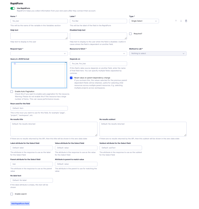
The Single Select field allows users to choose one option from a dropdown list.
Configuration Options
-
Name (required)
- The unique identifier for this field used internally.
- Example:
workspace_id - This will be the name of the variable in the Variables section.
-
Label (required)
- The name displayed to users on the form.
- Example:
Workspace - This will be the label of the field in the RapidForm.
-
Type (required)
- Select Single Select for this field type.
-
Help Text
- Additional guidance displayed under the field.
- Example:
Select the workspace you want to sync
-
Disabled Help Text
- Guidance shown when the field is disabled.
- Useful when the field depends on another field.
- Example:
Please select an account first
-
Required
- Determines if the field is mandatory.
- Options: Enabled or Disabled
-
Request Type (required)
- Method used to fetch data for the options.
- Options:
- Unified API
- Proxy API
- Example: Unified API
-
Resource to Fetch (required)
- The API endpoint or resource to fetch data from.
- Select the resource corresponding to the Request Type.
- Example:
ticketing/workspace
-
Method to Call (required)
- The API method used to fetch data.
- Options:
- list: Retrieves a list of items.
- get: Retrieves a single item.
- Example: list
-
Query in JSON Format
- Additional query parameters in JSON format to refine the data fetched.
- Example:
{
  "status": "active"
}
-
Depends On
- Specifies fields this field depends on.
- Enter field names separated by commas.
- Example:
account_id(if the workspace depends on the selected account)
-
Reset Value on Parent Dependency Change
- Determines if the field should reset when a parent field changes.
- Options: Enabled or Disabled
-
Enable Auto Pagination
- Enables automatic loading of more items as the user scrolls.
- Warning: Do not enable if the resource has a large number of items, as it may cause performance issues.
-
Noun Used for the Field
- The singular noun used to describe the items.
- Default:
item - Example:
workspace
-
No Results Title
- Message displayed when no data is returned.
- Default:
No results returned - Example:
No Workspaces Found
-
No Results Subtext
- Additional message when no data is returned.
- Default:
No results returned - Example:
Please check your account selection.
-
Label Attribute for the Select Field
- The attribute in the API response to use as the label.
- Default:
label - Example:
name(if the API returnsnameas the workspace name)
-
Value Attribute for the Select Field
- The attribute in the API response to use as the value.
- Default:
value - Example:
id(if the API returnsidas the workspace identifier)
-
Subtext Attribute for the Select Field
- An additional attribute to show as subtext.
- Default:
subText - Example:
description(to display a brief description under each option)
-
Parent Attribute for the Select Field
- The attribute in the response used for grouping options under a parent.
- Example:
organization_name(if workspaces are grouped by organization)
-
Attribute in Parent to Match Value
- The attribute in the parent used to match values.
- Default:
value - Example:
organization_id
-
No Label Text
- Text displayed when the label attribute is empty.
- Default:
No label - Example:
Unnamed Workspace
-
Enable Search
- Allows users to search within the data.
- Options: Enabled or Disabled
Multi Select
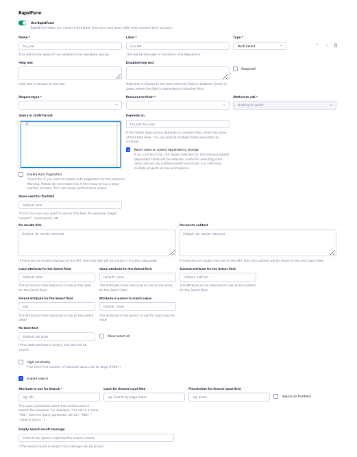
The Multi Select field allows users to choose multiple options from a list.
Configuration Options
-
Name (required)
- The unique identifier for this field used internally.
- Example:
project_ids - This will be the name of the variable in the Variables section.
-
Label (required)
- The name displayed to users on the form.
- Example:
Projects - This will be the label of the field in the RapidForm.
-
Type (required)
- Select Multi Select for this field type.
-
Help Text
- Additional guidance displayed under the field.
- Example:
Select the projects you want to sync
-
Disabled Help Text
- Guidance shown when the field is disabled.
- Example:
Please select a workspace first
-
Required
- Determines if the field is mandatory.
- Options: Enabled or Disabled
-
Request Type (required)
- Method used to fetch data for the options.
- Options:
- Unified API
- Proxy API
- Example: Unified API
-
Resource to Fetch (required)
- The API endpoint or resource to fetch data from.
- Example:
ticketing/project
-
Method to Call (required)
- The API method used to fetch data.
- Options:
- list
- get
- Example: list
-
Query in JSON Format
- Additional query parameters in JSON format.
- Example:
{ "workspace_id": "{{workspace_id}}" } - Note: Using
{{workspace_id}}pulls the value from theworkspace_idfield.
-
Depends On
- Fields this field depends on.
- Enter field names separated by commas.
- Example:
workspace_id
-
Reset Value on Parent Dependency Change
- Determines if the field should reset when a parent field changes.
- Options: Enabled or Disabled
- Example: Enabled
-
Enable Auto Pagination
- Enables automatic loading of more items as the user scrolls.
- Example: Disabled
-
Noun Used for the Field
- Default:
item - Example:
project
- Default:
-
No Results Title
- Default:
No results returned - Example:
No Projects Found
- Default:
-
No Results Subtext
- Default:
No results returned - Example:
Try selecting a different workspace.
- Default:
-
Label Attribute for the Select Field
- Default:
label - Example:
name
- Default:
-
Value Attribute for the Select Field
- Default:
value - Example:
id
- Default:
-
Subtext Attribute for the Select Field
- Default:
subText - Example:
description
- Default:
-
Parent Attribute for the Select Field
- Example:
category(if projects are grouped by category)
- Example:
-
Attribute in Parent to Match Value
- Default:
value - Example:
category_id
- Default:
-
No Label Text
- Default:
No label - Example:
Unnamed Project
- Default:
-
Allow Select All
- Enables users to select all options at once.
- Options: Enabled or Disabled
-
High Cardinality
- Tick this if the number of selected values will be large (1000+).
-
Enable Search
- Allows users to search within the options.
- Options: Enabled or Disabled
-
Attribute to Use for Search (required if search is enabled)
- The query parameter name used for searching.
- Example:
name
-
Label for Search Input Field (if search is enabled)
- Example:
Search Projects
- Example:
-
Placeholder for Search Input Field (if search is enabled)
- Example:
Enter project name
- Example:
-
Search on Frontend (if search is enabled)
- The search will happen on the loaded data with no additional API calls.
- Options: Enabled or Disabled
- Example: Disabled (search queries the API)
-
Empty Search Result Message
- Default:
No options matched the search criteria - Example:
No projects match your search
- Default:
Text
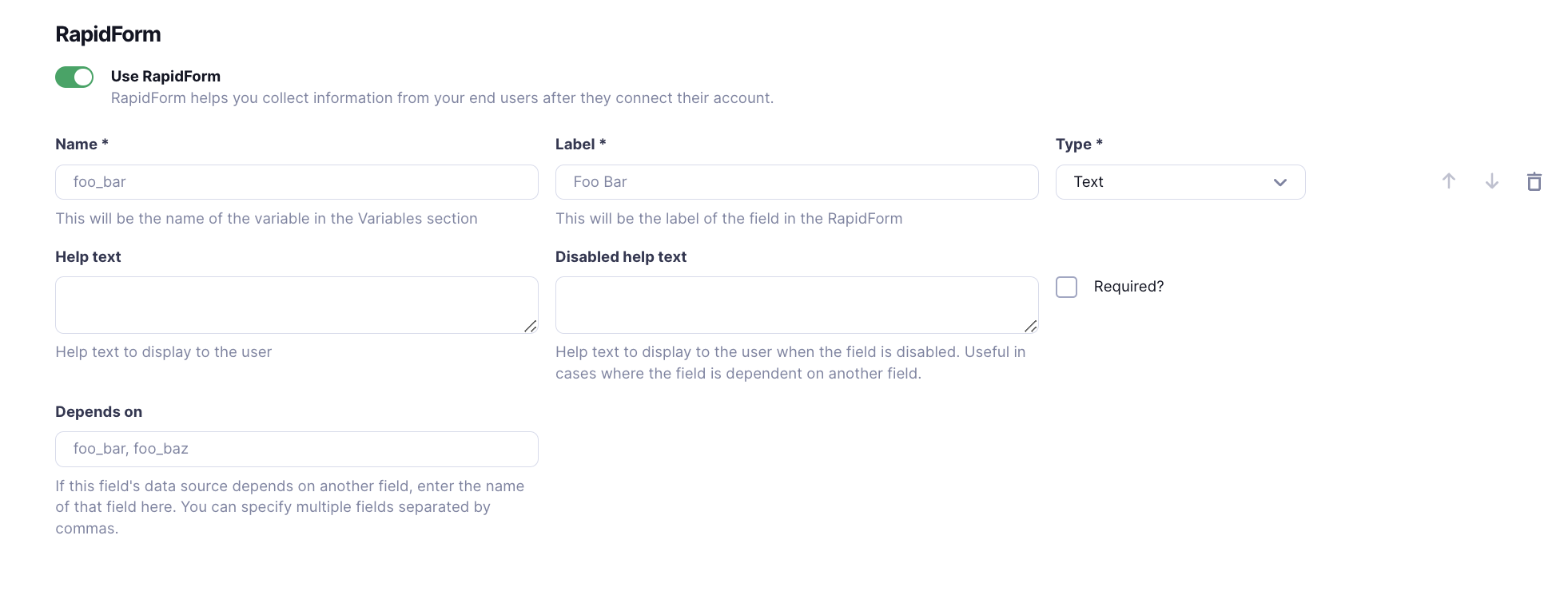
The Text field allows users to enter a single line of text. It is useful for custom inputs from the user.
Configuration Options
-
Name (required)
- The unique identifier for this field used internally.
- Example:
user_name
-
Label (required)
- The name displayed to users on the form.
- Example:
User Name
-
Type (required)
- Select Text for this field type.
-
Help Text
- Additional guidance displayed under the field.
- Example:
Enter your full name
-
Disabled Help Text
- Guidance shown when the field is disabled.
- Example:
This field is not editable
-
Required
- Determines if the field is mandatory.
- Options: Enabled or Disabled
-
Depends On
- Fields this field depends on.
- Enter field names separated by commas.
- Example:
user_id(if the name depends on a selected user ID)
Password
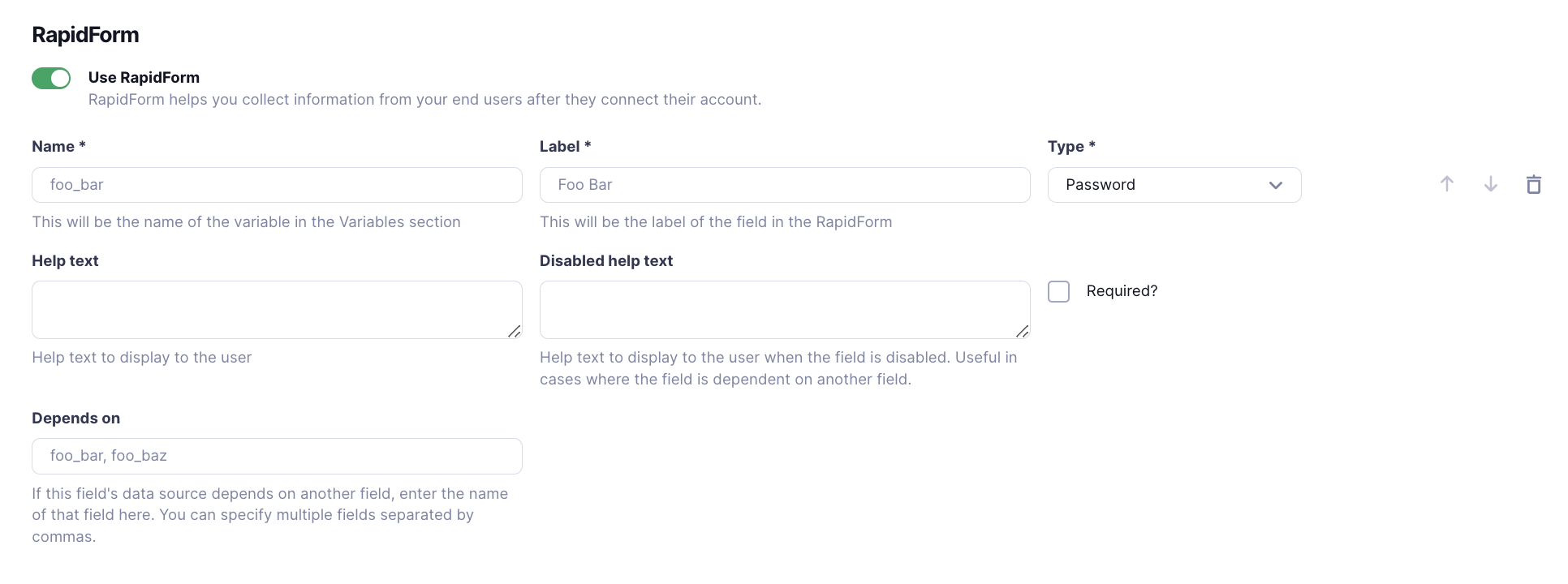
The Password field allows users to enter sensitive information securely. Useful for sensitive fields like passwords, API Keys etc.
Configuration Options
-
Name (required)
- The unique identifier for this field used internally.
- Example:
api_secret
-
Label (required)
- The name displayed to users on the form.
- Example:
API Secret
-
Type (required)
- Select Password for this field type.
-
Help Text
- Additional guidance displayed under the field.
- Example:
Enter your API secret key
-
Disabled Help Text
- Guidance shown when the field is disabled.
- Example:
Please complete previous steps
-
Required
- Determines if the field is mandatory.
- Options: Enabled or Disabled
-
Depends On
- Fields this field depends on.
- Enter field names separated by commas.
- Example:
api_key(if the secret depends on an API key entered)
Checkbox
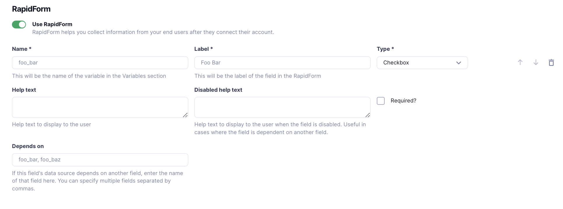
The Checkbox field allows users to select or deselect an option, representing a simple yes/no or true/false choice.
Configuration Options
-
Name (required)
- The unique identifier for this field used internally.
- Example:
subscribe_newsletter
-
Label (required)
- The name displayed to users on the form.
- Example:
Subscribe to Newsletter
-
Type (required)
- Select Checkbox for this field type.
-
Help Text
- Additional guidance displayed under the field.
- Example:
Receive updates and special offers
-
Disabled Help Text
- Guidance shown when the field is disabled.
- Example:
Option not available at this time
-
Required
- Determines if the field must be checked before submission.
- Options: Enabled or Disabled
-
Depends On
- Fields this field depends on.
- Enter field names separated by commas.
- Example:
email(if subscription depends on email being provided)
Hidden
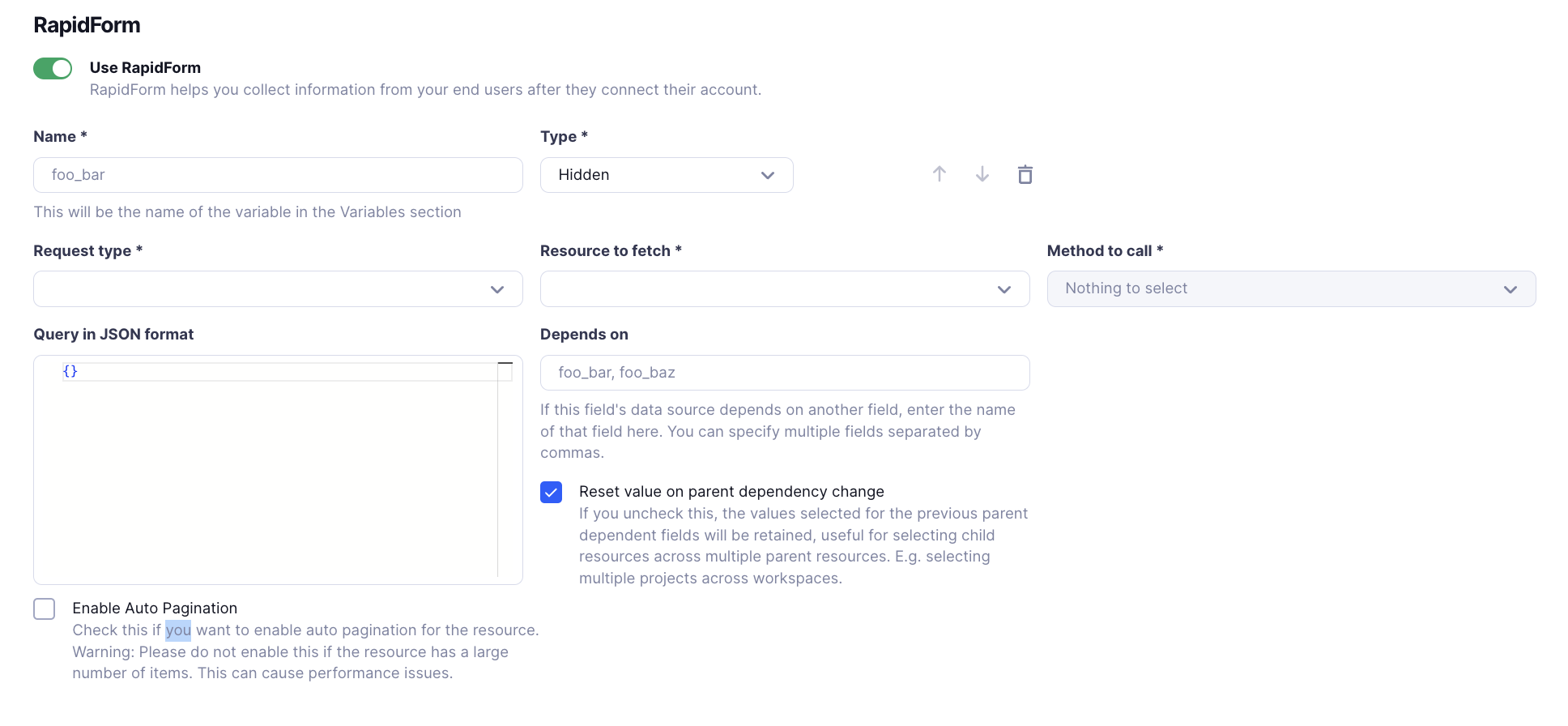
The Hidden field stores data without displaying it to the user. It's useful for passing data that doesn't require user input, such as default values, metadata, or values derived from other fields.
Configuration Options
-
Name (required)
- The unique identifier for this field used internally.
- Example:
session_token
-
Type (required)
- Select Hidden for this field type.
-
Request Type (required)
- Method used to fetch data for the hidden field.
- Options:
- Unified API
- Proxy API
-
Resource to Fetch (required)
- The API endpoint or resource to fetch data from.
- Example:
auth/session
-
Method to Call (required)
- The API method used to fetch data.
- Options:
- list
- get
-
Query in JSON Format
- Additional query parameters in JSON format.
-
Depends On
- Fields this field depends on.
- Enter field names separated by commas.
- Example:
user_id
-
Reset Value on Parent Dependency Change
- Determines if the field should reset when a parent field changes.
- Options: Enabled or Disabled
-
Enable Auto Pagination
- Warning: Typically not needed for hidden fields. Do not enable unless necessary.
Reordering and Deleting Fields
To adjust the order of fields in your form, use the arrows to reorder them. This allows you to easily adjust the flow of the form without needing to recreate the fields.
Use the delete button if you want to delete a field from your form.
